
Icons are used to present summarized information quickly. Different symbols are used for different types of data and, for most, different colors and symbols are displayed on the icon to show additional information.
Rolling the mouse over an icon will display detailed information, usually including the raw (i.e., encoded) report and a summary of major elements in the report. Note: Be sure to look at the raw details as often there are important details included with the remarks.
Clicking on an icon will also display detailed information, and will disable mouse roll-over. This may be useful if you need to copy information from the details, or if you want to click on a link within the detailed report. To update detailed display, either click on a different icon, or click on the detailed display itself, which will re-enable mouse roll-over.
Rolling over the map will show information about TFRs, AIRMETs and SIGMETs (if any) at the current mouse location, and clicking on the map will display AIRMET and SIGMET details and disable mouse roll-over.
METARs are displayed as blue-tinted circles, with the standard Aviation Flight Category colors and Cloud Coverage symbols. The Cloud Coverage displayed is based on the greatest coverage, regardless of altitude.
| Magenta | LIFR (Low IFR) - Ceiling below 500' and/or Visibility less than 1 mile or indefinite ceiling due to poor vertical visibility (METAR code VV) |
| Red | IFR - Ceiling 500 to 1000' and/or Visibility 1 to less than 3 miles |
| Blue | MVFR (Marginal VFR) - Ceiling 1,000 to 3,000 and/or Visibility 3 to 5 miles |
| Green | VFR - Ceiling greater than 3,000 and Visibility greater than 5 miles |


 |
SKC: Open Circle icon indicates clear sky (no cloud cover). Note that Visibility may still be restricted such that you may not have a green VFR icon. |


 |
CLR: Open Square icon indicates clear sky (no cloud cover) to at least 12,000'AGL. This differs from SKC Open Circle in that this square is used with automated reporting stations which cannot detect existence of clouds above 12,000'. SKC indicates a human observer sees no clouds. CLR indicates a reporting station cannot see clouds below 12,000'. |


 |
FEW: Open Circle, with line in half icon indicates Few clouds, by definition less than or equal to 1/4 sky. |


 |
SCT: Open Circle, with colored quarter icon indicates Scattered clouds, by definition at least 1/4, but less than or equal to 1/2 sky. |


 |
BKN: Three-quarters filled Circle icon indicates Broken clouds, by definition more than 1/2 but less than or equal to 7/8ths sky cover. |


 |
OVC: Filled Circle icon indicates Overcast clouds. Note that it may still be VFR if cloud altitude is high, and the visibility under the clouds is still good. |


 |
OVX: Circle with X indicates no reported cloud information, but reporting is obscured due to poor vertical visibility. The implication is ceiling 0' AGL. |


 |
Missing: M indicates no cloud information reported. However, the flight category is indicated by the color of the letter M. |

| Unknown flight category. Cloud or visibility information is missing or specified in a manner in which flight category cannot be determined. |
See also About Pilot Reports.
| Icing | Turbulence | ||||||||||||||||||||||||||||||||||||||||||
|---|---|---|---|---|---|---|---|---|---|---|---|---|---|---|---|---|---|---|---|---|---|---|---|---|---|---|---|---|---|---|---|---|---|---|---|---|---|---|---|---|---|---|---|
| Note "U" shaped design for Icing: color and vertical lines give clue to severity. Also, Icing PIREP icons lean to the left. | Note "^" shaped design for Turbulence: color and number of lines give clue to severity. Also, Turbulence PIREP icons stand straight up. | ||||||||||||||||||||||||||||||||||||||||||
|
|
 | Terminal Aerodrome Forecasts are displayed using the green tinted clock face. Forecasts involve future TIME, hence the clock. Or..., it's a checkmark: remember to CHECK the forecast. Or..., you help me with a better icon? |
SIGMETs are visible as bordered areas on the map, moving the mouse to within the border will change the border line from grey to red or orange, and details of the SIGMET will be provided.
 |
Convective SIGMET | Red, because it's a SIGMET. Convective because of the thunderbolt. |
 |
Convective Outlook | Orange because it's an Outlook, not (yet) a SIGMET. Convective because of the thunderbolt. |
 |
Turbulence SIGMET | Red, because it's a SIGMET. Turbulence because it uses the severe turbulence "^" symbol. |
 |
Icing SIGMET | Red, because it's a SIGMET. Icing because it uses the severe icing "U" symbol. |
AIRMETs are visible as bordered areas on the map, moving the mouse to within the border will change the border line from grey to green, yellow or blue, and details of the AIRMET will be provided.
 |
IFR AIRMET (Sierra) | Green, well, maybe because you'll not be able to see the ground? The Mountain obscuration looks like a mountain, and the IFR symbol reminds one of haze. |
 | Mountain Obscuration AIRMET (Sierra) | |
 | Turbulence AIRMET (Tango) | Yellow because perhaps that's how it will make you feel. Turbulence because it uses the moderate turbulence "^" symbol. |
 | Icing AIRMET (Zulu) | Blue because it's cold. Icing because it uses the moderate icing "U" symbol. |
 | Winds and Temperatures Aloft Forecasts (FB/FD) are displayed using the white balloon. Note that if TAFs and Winds Aloft of displayed at the same time, the TAF icon will be displayed on top, obscuring most of the white balloon. The balloon is a little taller than the TAF icon, so you will still be able to access it. If you're having trouble finding them, turn off TAF display using menu. |
TFRs are visible as bordered areas on the map, moving the mouse to within the border will change the border line from grey to red, and details of the TFR will be provided.
 | Temporary Flight Restrictions (TFRs) are displayed using the red Do Not Enter symbol. | |
 | Formula 1 Racing Stadium TFR | |
 | Indy Car Racing Stadium TFR | |
 | NASCAR Racing Stadium TFR | |
 | Major League Baseball Stadium TFR | |
 | National Football League Stadium TFR | |
 | NCAA Division I Football Stadium TFR | |
| Control Tower | Description | |
|---|---|---|
| With | Without | |
 |
 |
Public or Military Large Airport (at least one hard surfaced runway > 8069') with Fuel service |
 |
 |
Public or Military Large Airport (at least one hard surfaced runway > 8069') without Fuel service. (Yes, this looks just like the previous icon. Check Airport Details for, um, airport details. |
 |
 |
Public or Military Airport (at least one hard surfaced runway 1500' to 8069') with Fuel service |
 |
 |
Public or Military Airport (at least one hard surfaced runway 1500' to 8069') without Fuel service |
 |
 |
Public Airport without hard surfaced runway at least 1500' with Fuel service |
 |
 |
Public Airport without hard surfaced runway at least 1500' without Fuel service |
 |
 |
Military Airport without hard surfaced runway at least 1500' with Fuel service |
 |
 |
Military Airport without hard surfaced runway at least 1500' without Fuel |
 |
 |
Private Airport |
 | VOR |
 | VOR/DME |
 | VORTAC |
 | TACAN |
 | VOT |
 | NDB |
 | NDB/DME |
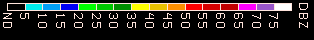
NEXRAD colors reflect the intensity (reflectivity) of the echo returns. See
discussion at NOAA
for details, but as a broad generalization the colors go from blue to green to yellow to red to magenta. Green is generally reported as Trace rainfall, blue would be less. Oranges and red are strong rain, dark reds to magenta are worse.
See detailed description of Surface Analysis Overlay on this help page
 | Airport/Facility Directory page for the selected location, from the latest FAA A/FD. Complete online version, including Legend and Supplements are available at FAA Aviation System Standards: Digital Airport/Facility Directory |
 | Airport Diagram page for the selected location, from the current FAA Terminal Procedures Publication (updated every 28 days). Complete online version, including Legend and Supplements are available at FAA Aviation System Standards: Digital Terminal Procedures Publication (d-TPP) Clicking this will display the current diagram. Note that the icon itself is not representative of the airport in question -- I think I'm using SFO for the icon. |
 | Warning: Data is known to be old. Because we expect METARs to be issued every hour, if the latest available METAR for a station is more than 90 minutes old, this symbol will be displayed next to the time in the details window. Also shown when TFR data feed is down, such that shown TFRs may be incomplete. Or if a particular TAF was issued more than 12 hours ago (since they should be updated more frequently.) When you see this symbol, mouse over it, and a message will be displayed with details about the warning. |
Suggestions? Questions? Corrections? Let us know! Email


