
Surface Analysis is a representation of observed frontal weather, showing the position and extent of warm, cold, occluded, and stationary fronts. Relative High and Low pressures are noted on the overlay, as well as troughs (trofs) which are low pressure "valleys".
Frontal weather is best seen on the AvnWx.com maps when viewing the map zoomed out such that you can see most of the continental US at the same time. When looking at Surface Analysis, you may find it informative to also view NEXRAD and AIRMETs and SIGMETs. Viewed together, these different reports show you different ways of observing the current weather.
Relative High pressure areas are designated with large blue H, and relative Low pressure areas are designated with a large red L.

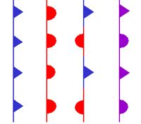
Unlike conventional surface analysis charts, such as those found at NOAA's NWS Ocean Prediction Center, AvnWx.com does not attempt to draw symbols along the lines (such as seen in the graphic to the right). However, if you recall your basic meteorology, you'll be able to quickly determine the direction of most fronts without the need for "icicle" and "umbrellas" pointing the way.

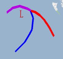
For example, the image to the left shows a typical frontal wave, where the blue cold front is coming down (moving towards the southeast) on the left, and the red warm front is moving up (towards northeast) on the right of the image. In between these two fronts, is a low pressure area, with the weather spinning around this low pressure area in a cyclonic or counter-clockwise rotation. You know this is the way the fronts are moving because in the northern hemisphere they ALWAYS move this way -- there should be no need for pointy icicles on the cold front or rounded umbrellas on the warm front. Note that the cold front (which tends to move faster than the warm front as they both rotate) has caught the warm front in the upper part of the image, as shown by the purple occluded front.
Consider one more, hopefully obvious point... Cold fronts are large, um, cold airmasses. Cold, because they come down from cooler Canada. Warm fronts are large warm airmasses. Warm, because they come up from the Gulf of Mexico. Add to that the fact that North American weather tends to move from west to east. This being the case 99.9999% of the time, whenever you see a blue line, you can assume the cold front represented by the blue line is moving generally south, and the red warm front is moving generally north. Where they meet, they will rotate in a counter-clockwise fashion such that the cold front continues to move down and to the right, the warm front will move up (and perhaps to the left, though not as commonly).
Data is updated by NOAA every three hours, with a published VALID time. AvnWx.com displays current VALID time in the menu, next to the Surface Analysis menu item. Typically, VALID times are 00z, 03z, 06z 09z, 12z, 15z, 18z, and 21z. Overlays are available once the data is published, usually about an hour after the VALID time.
Surface Analysis is not provided for older versions of Internet Explorer at this time. Unfortunately, IE6 and below are really bad at memory allocation associated with overlays and this resulted in numerous browser crashes. IE7 works fine. Firefox and Safari also work fine. Given the problems associated with the older IE6 browser, we strongly suggest you upgrade... perhaps access to the surface analysis feature will be sufficient to get you moving into the 21st century.
More information is available on the map's Forms and Controls, on the map's icons, and on the data sources.
Suggestions? Questions? Corrections? Let us know! Email